
A lifestyle-driven tequila brand that captures warm light, effortless leisure, and indulgent simplicity — from bottle to pop-up hotel.
SORBIDO
Simple, Classic, Warm
– Brand Strategy & Identity
– Typography System + Color Palette
– Packaging Design
– Art Direction
SCOPE:


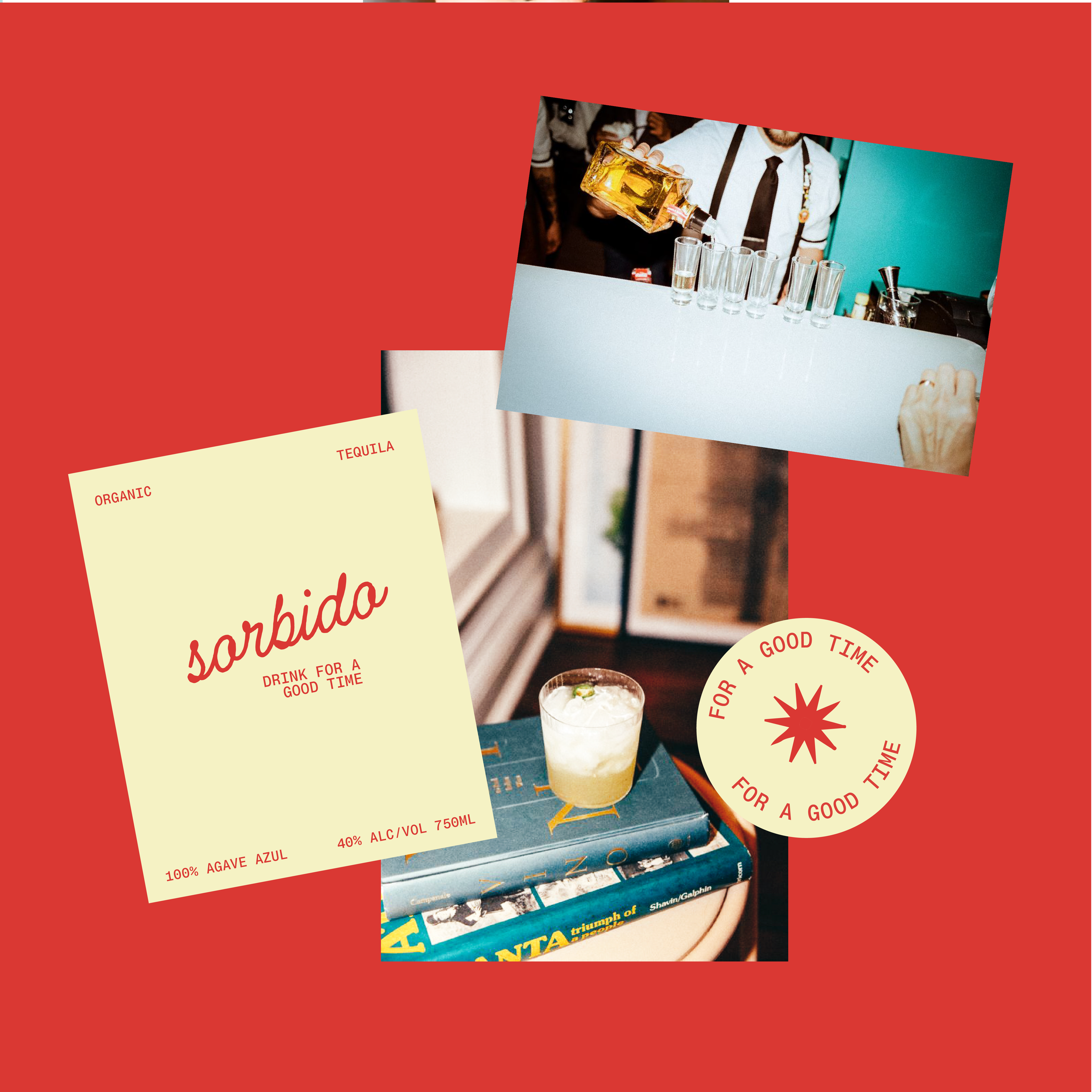
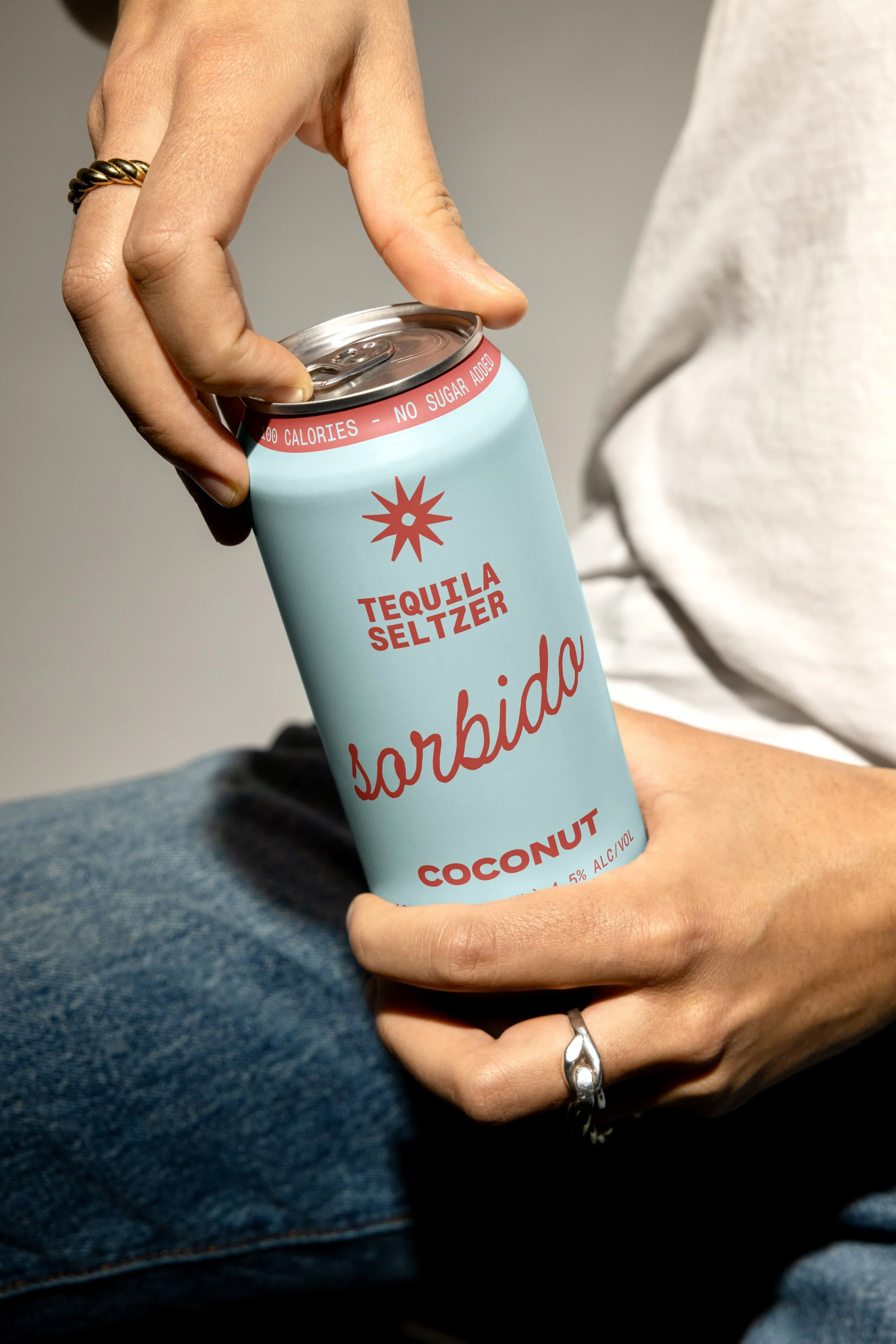
Sorbido was designed as more than tequila — it’s a lifestyle brand. From the start, our goal was to translate the sensory experience of sipping into a visual one: warm light, effortless leisure, and a touch of indulgence.
PROJECT OVERVIEW

BRAND IDENTITY
This is a premium tequila brand that felt timeless yet modern, with storytelling and visuals that extended beyond the bottle. The challenge was balancing luxury and approachability — a brand that could live in both a curated home bar and a beach-side resort.


CASA SORBIDO (THE POP UP)
Bringing the world of Sorbido into a physical space was a natural extension of the brand. Casa Sorbido, a concept pop-up hotel in Jalisco, embodies the same warmth and restraint as the bottle — minimal, modern, and wholly in good spirits.
PROJECT CREDITS:
Creative Direction: Julie Garcia
Branding: Julie Garcia