
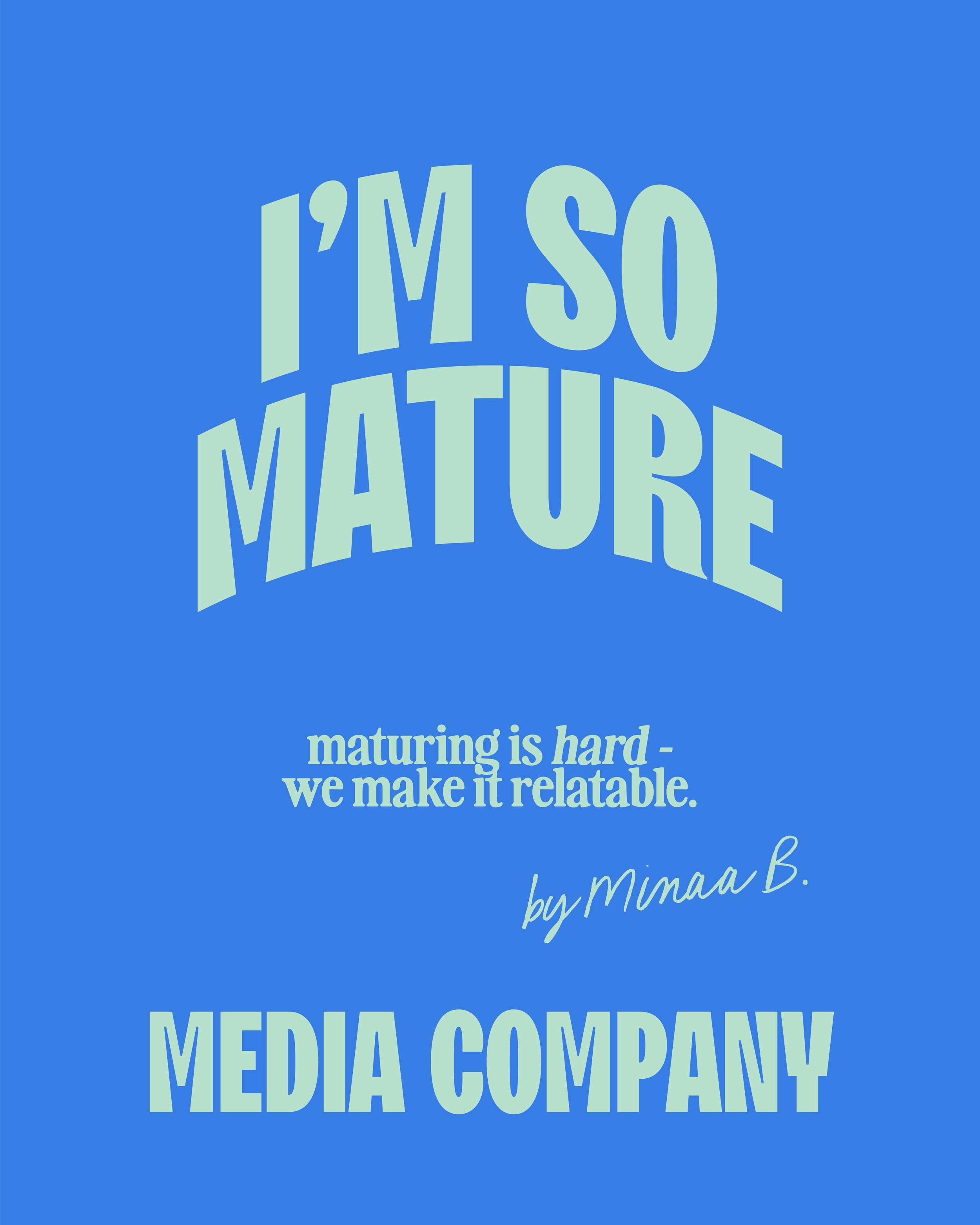
A playful identity and digital ecosystem for a media brand bridging pop culture, music, and personal growth.
I’M SO MATURE
Modern, Approachable, Bright
– Brand Strategy & Identity
– Digital Style Guide
– Squarespace Website Design
– Substack Logo Suite & Assets
– Social Template System
SCOPE:


I’m So Mature is a culture-driven media brand bridging pop culture, music, and personal growth. They needed a visual world that could flex across channels — from Substack to social — while speaking fluently to a Gen Z and millennial audience.
PROJECT OVERVIEW


The founder wanted the brand to feel playful and current without losing credibility. The existing identity was minimal but lacked the tone, energy, and edge of the community it served.
BRAND IDENTITY
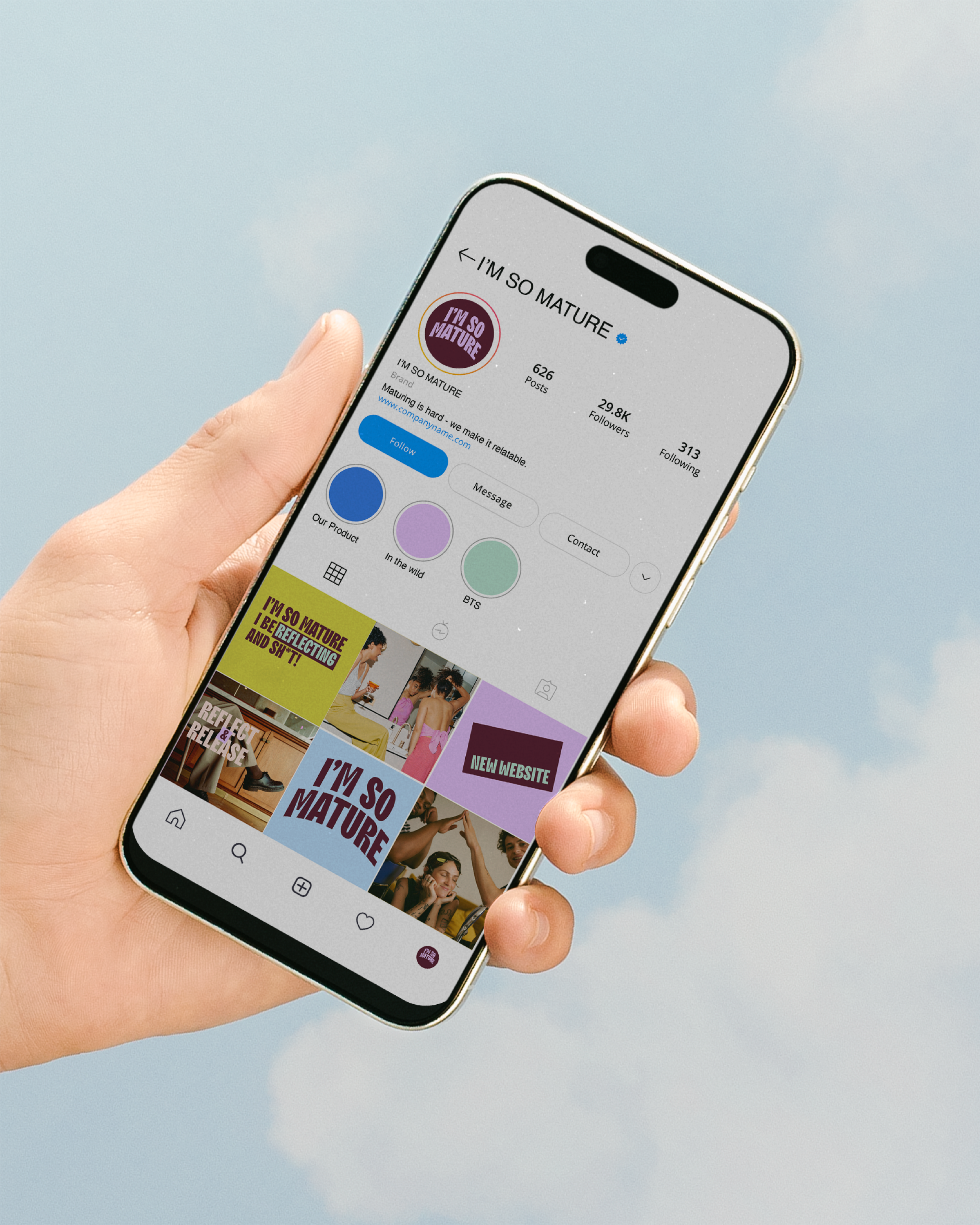
WEB DESIGN
Designed on Squarespace, the site and Substack ecosystem carry the brand’s tone through every headline and color shift. Custom icons, animated details, and photography direction bring the voice to life online without sacrificing clarity.


PROJECT CREDITS:
Creative Direction: Julie Garcia
Branding: Julie Garcia
Web Design: Julie Garcia