
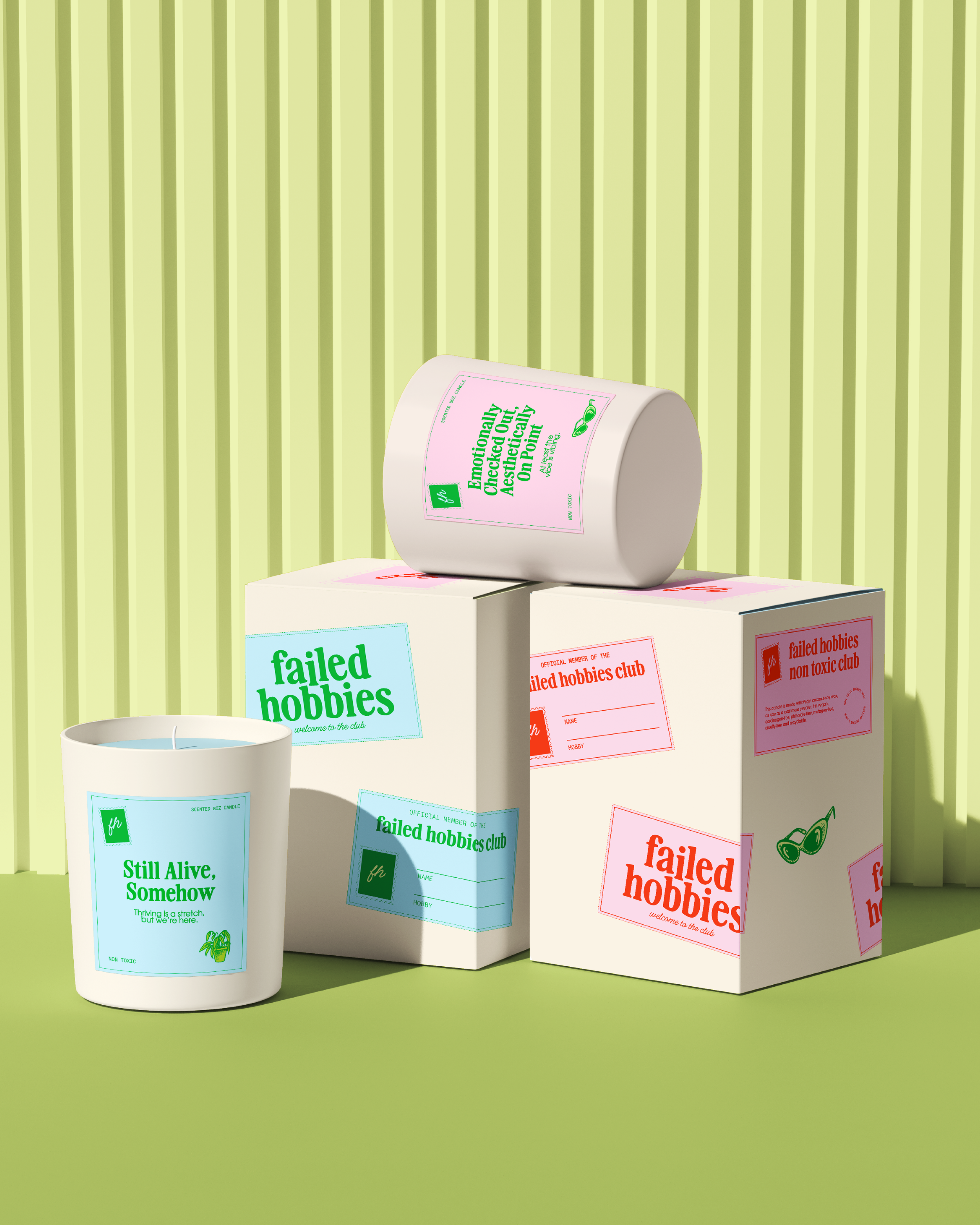
A cheeky candle brand that celebrates the chaos of everyday life. Originally brought on for packaging and web design, the project evolved into a full visual refresh that captured the brand’s humor and relatability.
FAILED HOBBIES
Fun, Approachable, Trendy
– Brand Strategy & Identity
– Typography System + Color Palette
– Packaging Design
– Shopify Website Design & Build
SCOPE:

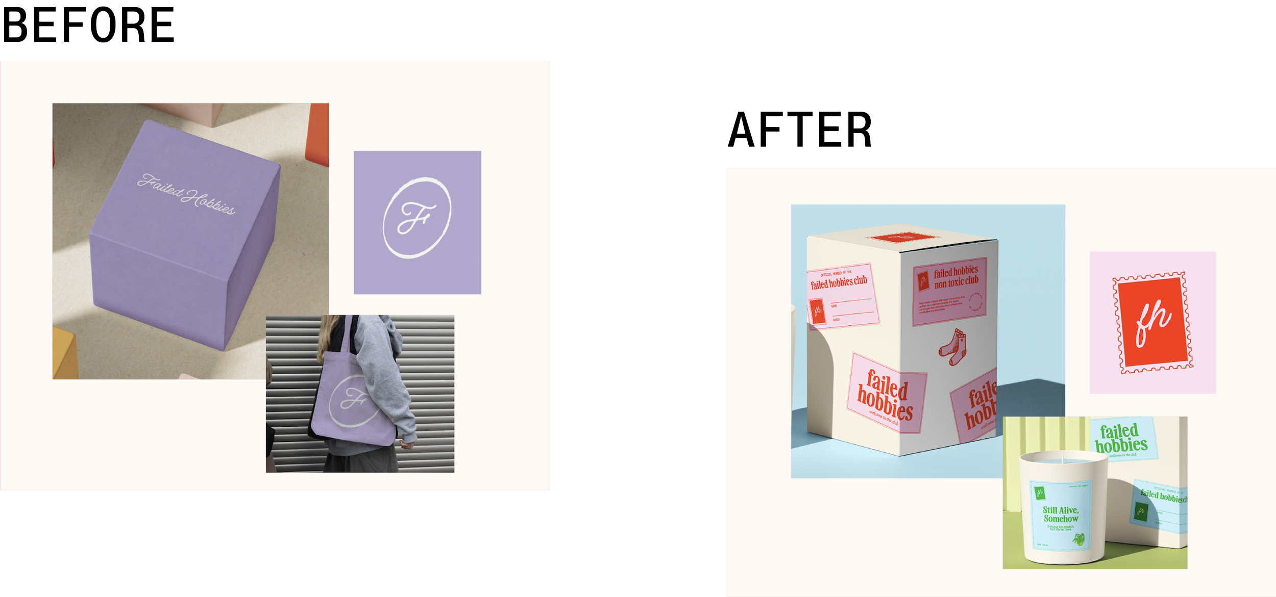
The previous look was soft and feminine — pleasant but forgettable. The founder wanted a brand that felt as sharp and funny as the product names themselves, something bold enough to live on shelves and social feeds alike.
THE CHALLENGE
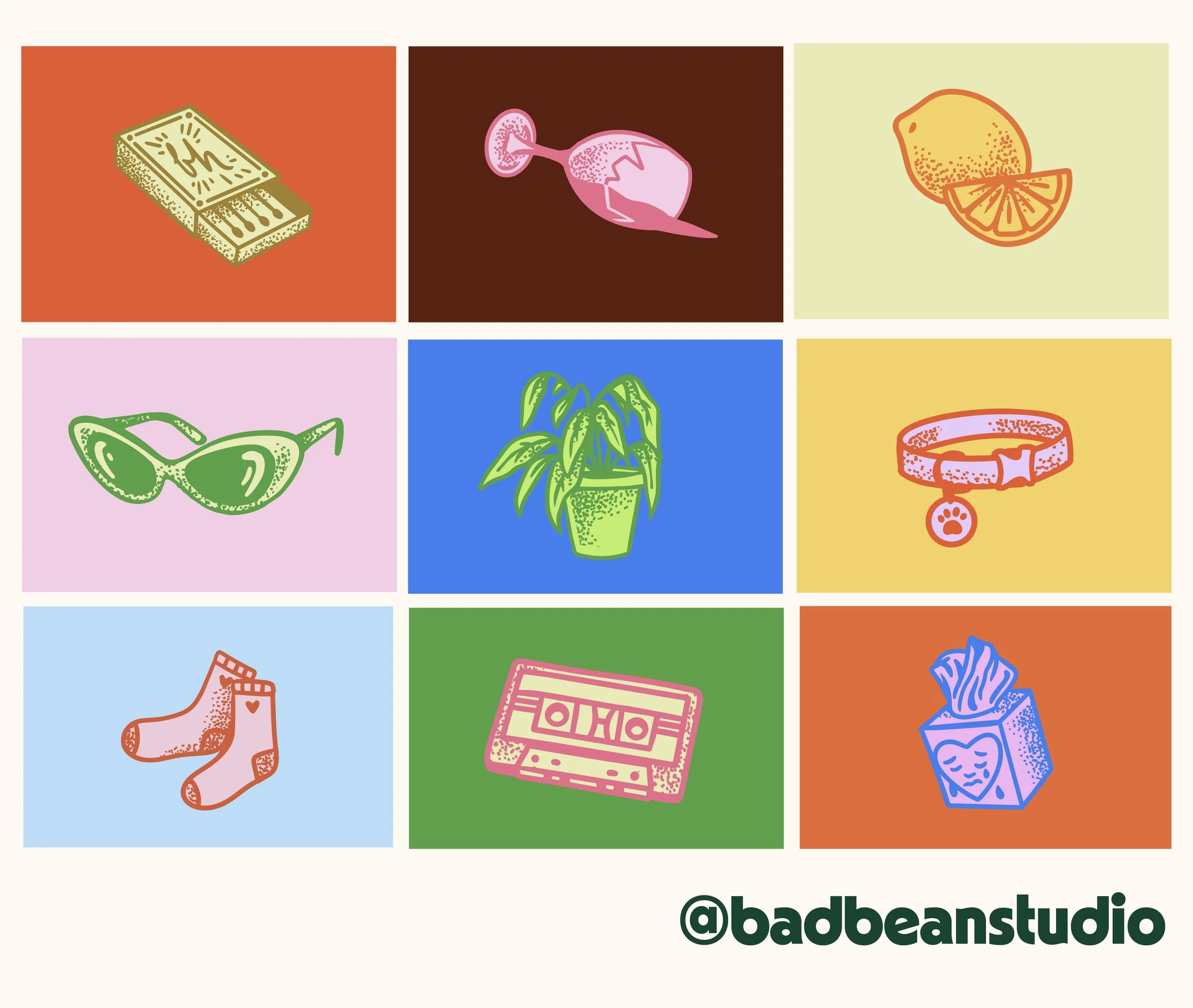


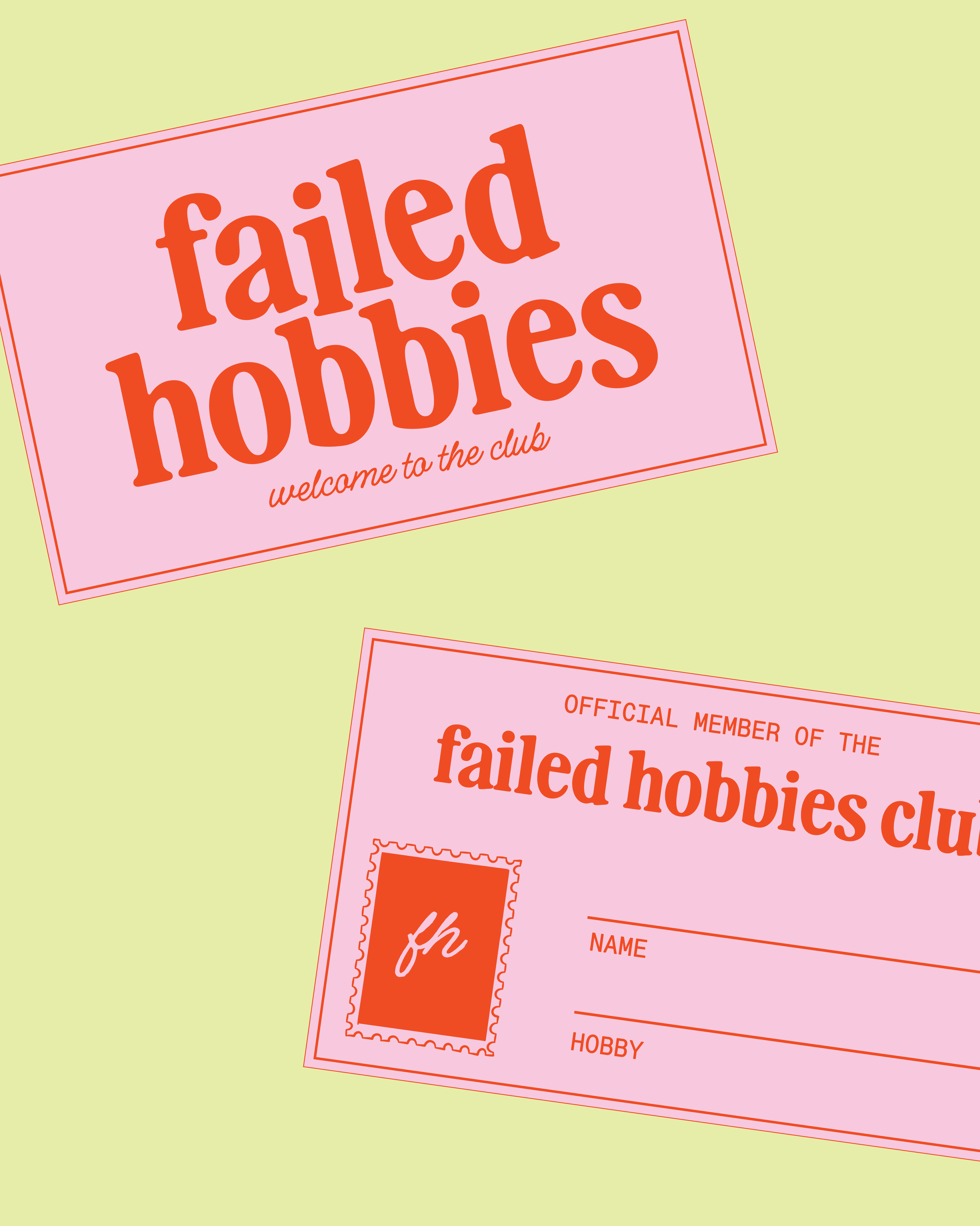
We anchored the brand in its tone of voice first: relatable, witty, and a little dramatic. Visually, that translated into high-contrast color pairings, expressive type hierarchies, and fun illustrations.
BRAND IDENTITY & STRATEGY

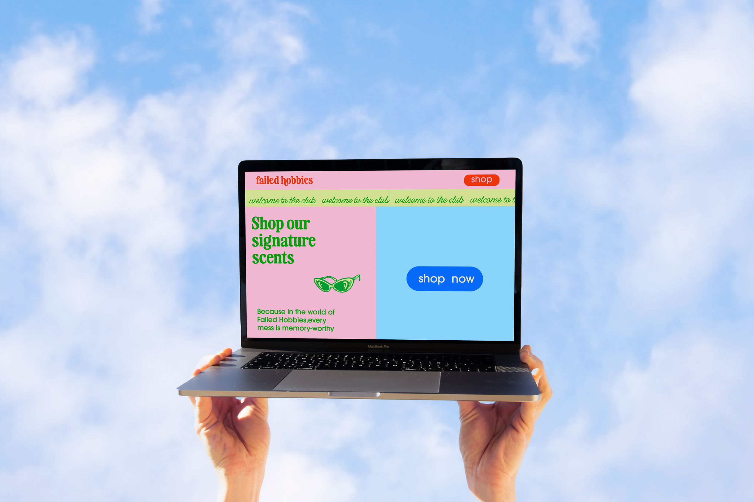
The shop experience extends the brand’s playfulness through scroll motion and type-driven headlines. Bright accents and macro photography bring the candles’ personality to life while keeping checkout clear and fast.
WEB DESIGN
PROJECT CREDITS:
Creative Direction: Julie Garcia
Branding & Packaging: Julie Garcia
Illustrations: Justine Wollman
Website: Kari Livingston